Picking fabric can be the most exciting or the most stressful part about starting a new project and there are many common struggles. You might be trying to use up your stash, but don’t know what fabrics go together. Or maybe you found a fabulous print, but you don’t know what other fabrics will look good with it. Lack of confidence in the fabric pull process can lead to ignoring your fabric stash. But no shame in that game. We wouldn’t blame you for settling for a Cottoneer Bundle, precut bundle, or a quilt kit made with fabrics from the same collection.
Developing an Eye for Color
Creating the perfect fabric pull is a mix of science and intuition. You can train your eye to recognize color harmony. It starts with color theory. Once you understand the rules, you can lean on your intuition to do the rest. Brushing up on these key color theory principles can help you create balance in your next project and approach your next fabric selection with confidence, rather than uncertainty. Even better, our fabric swatch cards can help!
What is Color Theory
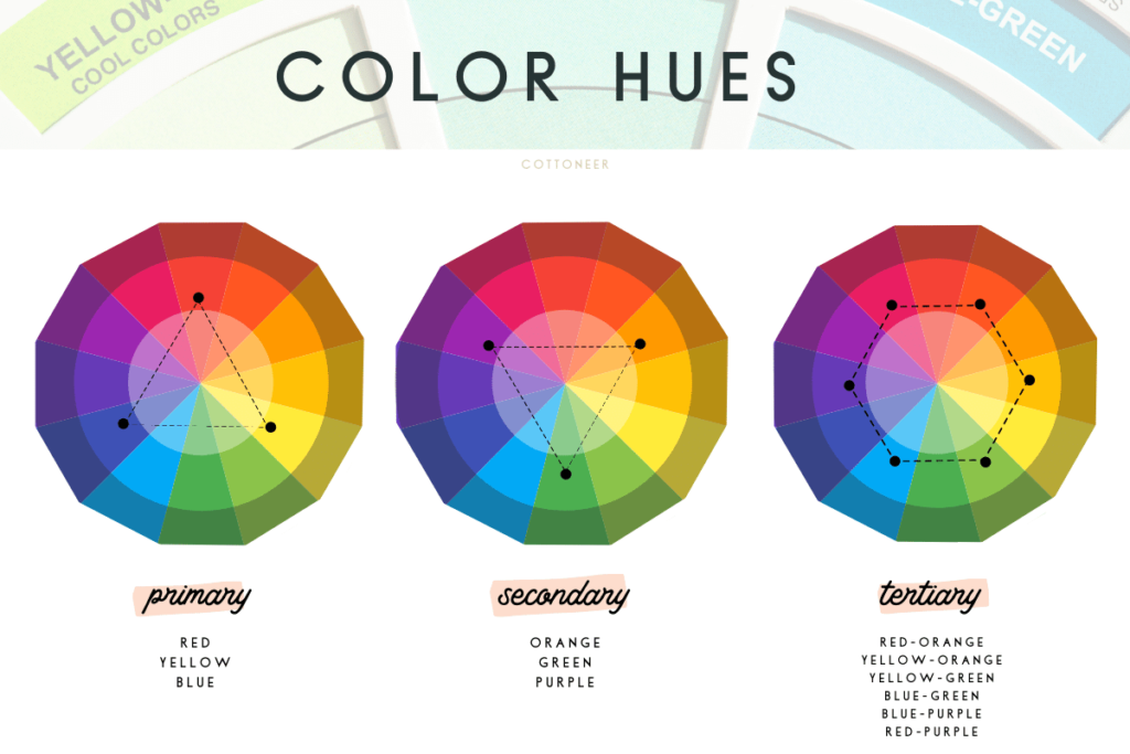
Color theory is simply how colors interact and relate with each other. The colors (or hues) you pick for a quilt showcase your personality – they’re what make your quilt unique! Here’s what you need to know about hues.
HUE: Another name for color.
- Primary Colors: all colors are derived from these three hues
- Red, Yellow and Blue
- Secondary Colors: formed by mixing primary colors
- Orange (red + yellow), Green (yellow + blue), and Purple (blue + red)
- Tertiary Colors: formed by mixing primary and secondary colors
- Red-Orange, Yellow-Orange, Yellow-Green, Blue-Green, Blue-Purple, Red-Purple
Tip: Warm colors tend to pop out and cool colors tend to recede into the background. You can change the focus of your quilt by playing around with warm and cool colors.
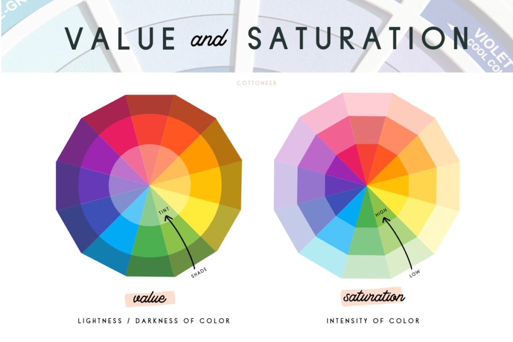
VALUE: Each hue has a spectrum from light to dark.
- Shade: when black is added to a hue to create dark value
- Tone: when black is added to a hue to create dull or washed-out value
- Tint: when white is added to a hue to create a light value
Tip: Incorporating different values into your quilt creates depth and contrast. Aim to have three values (light, medium and dark) in your color palette to make your quilt look three-dimensional. Use dark values for elements where you want the most visual impact.
SATURATION: Each hue has a brightness spectrum from low to high.
- Low Saturation: dull, muted or faded colors
- High Saturation: bright, bold, or vibrant colors
Tip: Balance your color palette with both low and highly saturated colors. Low saturation colors help soften a loud palette and make it look more mature/less wild. High saturation colors help brighten up a dull palette.
NEUTRALS: Weak colors that allow other colors to move forward in the design. Neutrals can be white, black, grey, brown, navy or even a colorful hue in a dark shade, light tint or low saturation.
Tip: Neutrals are great for backgrounds or areas you want to be less noticeable. Keep in mind that depending on your color palette, bright whites and dark blacks can sometimes pop, rather than give the eye a place to rest.
Color Relationships
Keep these color relationships in mind when designing a color palette for your next project.
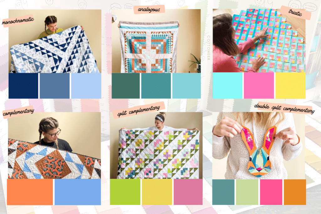
- Monochromatic – A monochromatic color palette is made entirely from a single hue, with varying values and saturation levels. The contrast of light and dark or dull and bright can be used to create a gradient effect or distributed randomly to create a cohesive mosaic look.
Tip: Use monochromatic prints or batiks, or even textured solids like wovens in colors from your palette, to give your quilt a more dynamic look.
- Analogous – An analogous color palette uses neighboring colors on the color wheel (like red, orange and yellow). These colors go well together because their color roots are similar.
Tip: Pick an assortment of solids and prints in neighboring colors. Or add a pop of an analogous color to a monochromic palette (e.g., a pop of yellow in a monochromatic red palette).
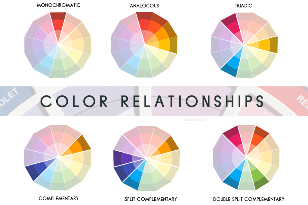
- Triadic – A triatic color palette uses 3 colors that are evenly spaced around the color wheel. This is a simple formula for a colorful palette, but can be sometimes feel intimidating with all the different colors.
Tip: Vary the value and saturation of the triatic colors to help balance your quilt.
- Complementary – A complementary color palette uses colors that are opposite one another on the color wheel (e.g., orange and blue). Pairing these colors together is eye-catching because they contrast (opposites attract!) and include both warm and cool hues. A split complementary color palette can be created by pairing a color with its complementary color plus one or two colors adjacent to its complement (e.g., orange and blue + teal). A double split complementary color palette can be created using two pairs of complementary colors that form an X on the color wheel (e.g., red and green + orange and blue).
Tip: When using complementary colors, use them in unequal amounts. If they’re in similar proportions, your quilt design may be difficult to decipher because the eye will have nowhere to rest. A neutral background can help soften the contrast and intensify the impact of your colors. Use complementary colors to add a pop to a monochromatic or analogous color palette or use it in a binding or backing for a fun and unexpected color experience.
How to Create the Perfect Fabric Pull
The only way to train your eye to see color harmony is to practice! Here are a couple fun ways to help you create the perfect fabric pull for your next quilt.
- Practice with your stash: Pull out three fabrics from your stash and work to make them go together by varying the colors, values, saturation levels and neutrals until you have a color palette that is balanced and pleasing to you.
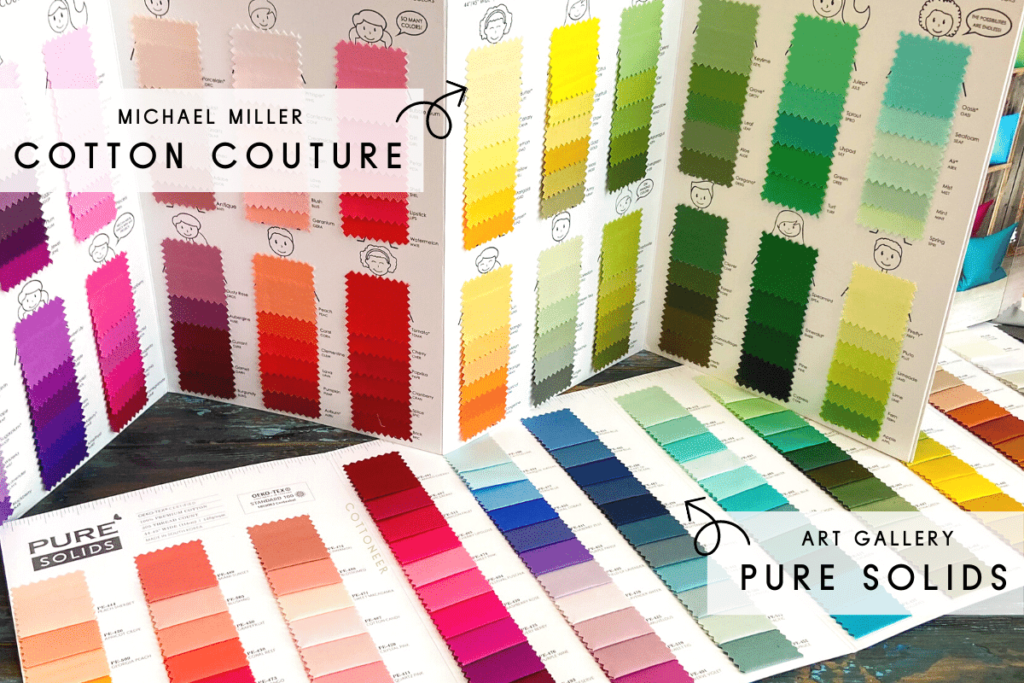
- Use swatch cards: Swatch cards (like this Art Gallery Pure Solids Swatch Card, or our Cotton Couture Solids Swatch Card) can help you pair the right solids with your favorite print or fabrics from your stash.
- Use pictures for inspiration: Pictures are a great way to inspire color palettes. Accounts like Color Palette Cinema or Accidentally Wes Anderson offer colorful images that make great color palettes. Need a reminder on how to save your favorite images on Instagram? Check out our 4 Reasons to Engage on Instagram post.
- Play with color palette generators: Apps like Pantone Studio allow you to take a picture and turn it into a color palette. Or upload an image onto your desktop and use Coolors to generate a color palette collage.
Want to Skip The Madness?
You can purchase beautiful fabric pulls that we have taken the care to match just for you! Find all of our bundles in the shop here.


I haven’t delved deeply on your posts, so pardon me if I’m repetitive. Could you talk about/illustrate how different types of illumination change the appearance of colors? That is, flourescent vs incadenscent vs LED vs natural? I feel that it’s always a bit of a crap shoot until you get the actual fabric in hand in your own space. (I also may be very sensitive to the color shift in flourescent light.)